The Brief.
From a small biotech start-up, Phenotypeca grew quickly gaining recognition as a leader in their field. To capitalise on this, they wanted to reposition the brand and rebuild their website to reflect the company’s aspiration of becoming an established player in the market and a credible provider of global biotech solutions.


Consideration.
The new visual identity should embody the innovative nature of the business and reflect the unique solutions it develops.
Access and availability are at the heart of the business model. This must be reflected in all brand communications.
Brand communications must explain to non-tech as well as tech audiences the science behind their revolutionary technology and make it unique to Phenotypeca.


Solution.
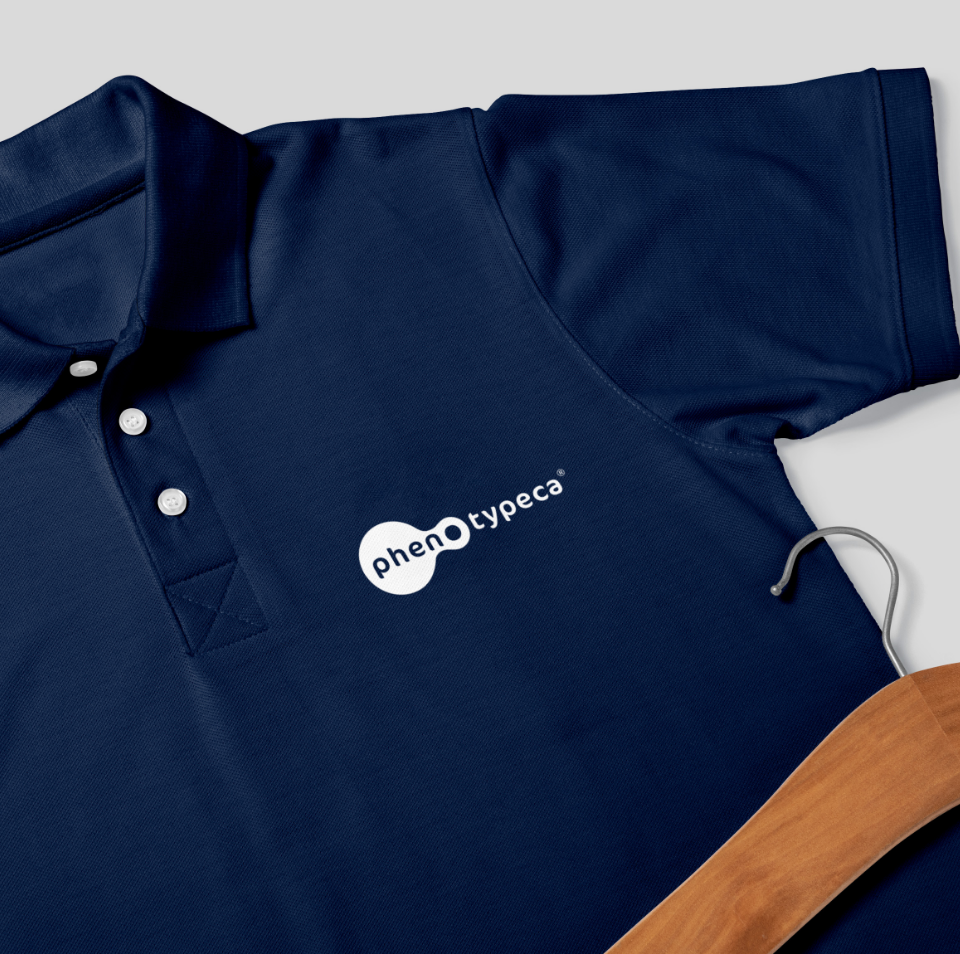
A new visual identity, using a strong, fluorescent colour palette was at the heart of our strategy to reposition the brand. The inspiration behind the design came from an abstract visualisation of yeast cells and provided a strong visual link to the uniqueness of the science pioneered by the company.
In-house 3D and animation skills brought the design to life, creating a living ‘entity’ in keeping with actual yeast cells.
Given the very technical nature of the content, web page layouts were designed to make the overall user journey more intuitive and user-friendly, giving instant access to key information.
In order to reposition the brand amongst its scientific peer group, IvyJack identified key trade journals and, through relationship building with key editors, secured high-value editorial exposure during a 6-month campaign. This included homepage leadership positions online and full-page coverage in print titles ensuring maximum brand exposure and resulting in well over 500,000 brand combined impressions. As a result of our PR and social media campaign, the business has seen higher audience engagement levels, increased brand awareness and improved commercial success.

